高端奶片包装设计x北斗设计
发布时间:2021-05-17 22:23
作为创意人,有时候活在理论,但时候又奔跑在天马行空中。
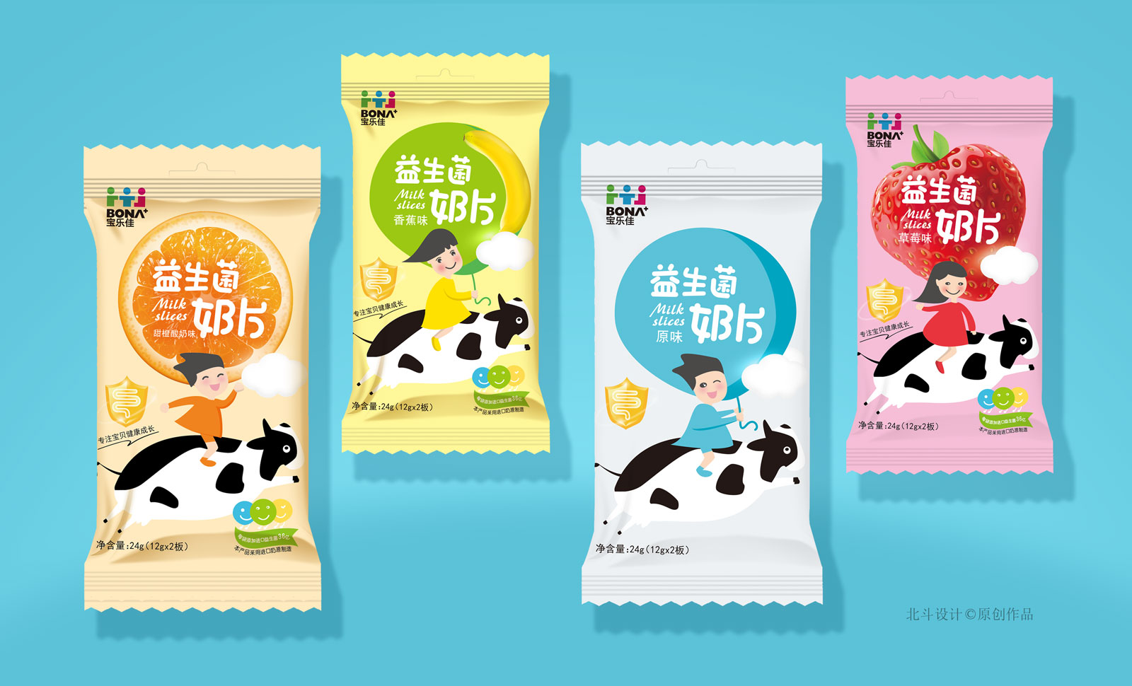
感谢莱可福集团对于北斗设计的信任,此次合作还算非常顺利的完成了新品的策划设计定稿。此次合作的为高端牛奶片糖果食品包装设计,此系列产品针对的消费核心人群为:儿童。北斗设计通过对于目标消费人群的思考与洞察,创作了好多有趣的插画作为品牌包装的原创元素。比如天马行空的马改成了牛。这样就能出现了很多童趣的画面、正好符合小孩子的天真无邪的画面感。
色彩哲学运用
色彩是最能打动消费者的,北斗设计对于运用的每一种色彩都会根据心理学的折射来选用。比如我们在给牛奶片包装设计配色时,先试从每个不同产品不同口味的味蕾的联系来搭配出是色彩的色相,然后在通过小孩子对于色彩的认知及色彩的纯净度的感想做实验。最后我们再根据印刷色彩在不同材质上的折射效果,最终才能选定出符合产品并能打动用户的色彩。
As an artist, sometimes live in theory, but when I run a horse the air in the day.
Thank you can design the group for the beidou trust, the cooperation is very smoothly finished product planning design finalized. The partnership as a high-end milk candy packaging design, this series of products for the consumption of the core people: children. Beidou design by the target consumers think and insight, created a lot of interesting illustrations as original elements of brand packaging. Such as a powerful and unconstrained style Ma Gaicheng cattle. So it can appear a lot of tong qu exactly the picture, the innocence of the children in scope.
The color of philosophy
Colour is one of the most can impress consumers, beidou design for the use of every kind of colour to choose according to the psychology of refraction. When we give milk packaging design match colors, for example, try from each different products of different taste buds is to match the color hue, and then through the child perception of color and color purity of the experiment. Finally, we again according to the refraction effect on the printing color in different materials, eventually can move to a selected conforms to the product and the user's color.