36雨荞麦面条包装设计落地x北斗设计
发布时间:2022-03-23 15:51
三十六雨荞麦面条包装设计x北斗设计原创
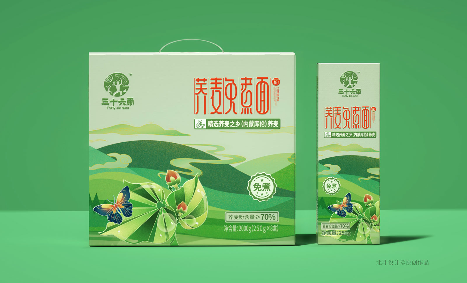
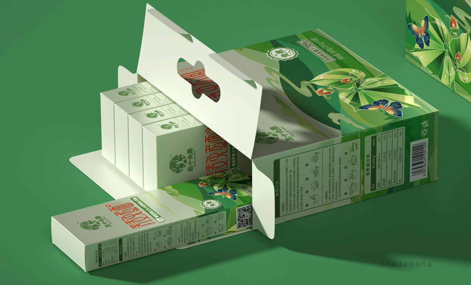
这是北斗设计为三十六雨策划的有一个新品包装设计,整体的设计风格依然保持着品牌原有的家族形象,我们只是在字体设计上做出了改变,以及产品包装的颜色改变,我们从一开始的规划是四款礼盒,通过初夏秋冬四种色调来表达我们的产品区别。
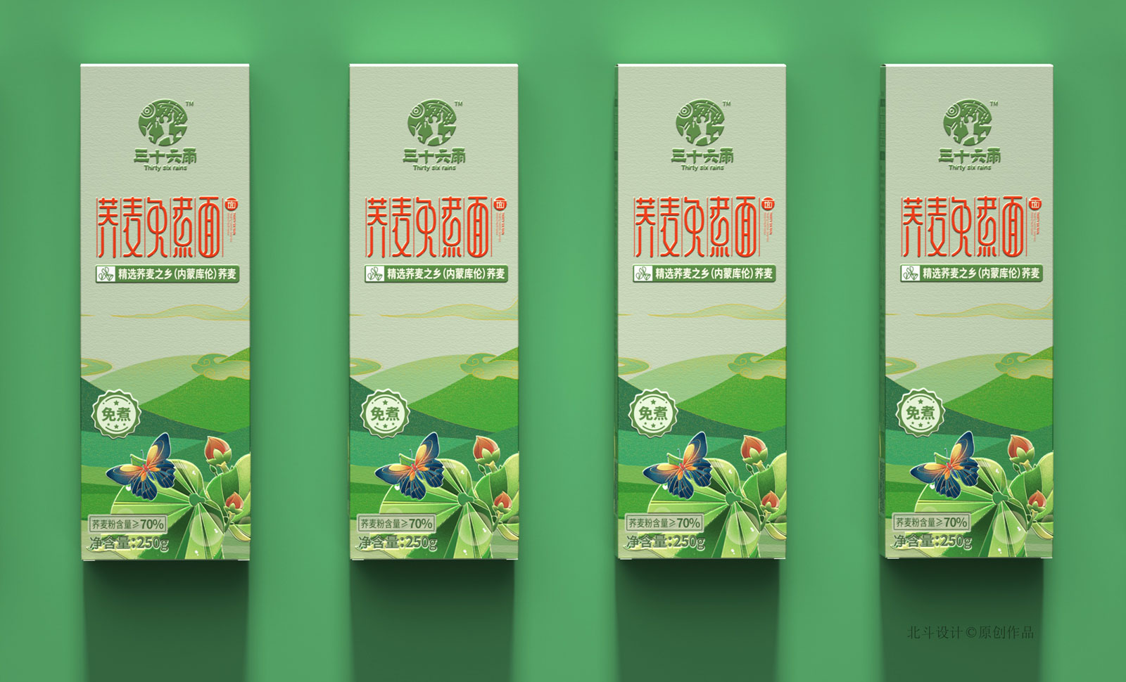
荞麦面这款包装设计的采用的是绿色作为主色调,因为考虑到这是一款原汁原味的荞麦面,它的味道,口感,工艺都非常符合生态农产品的定位,绝对的绿色健康食品。
同时为了能够更好的表达出荞麦产品的特色,我们依然是采用手绘形式表现荞麦作为前景主要元素,刻画了云绕山川的背景作为背景元素,蕴意自然生态的和谐,造就自然有机的产品概念。
这是北斗设计为三十六雨策划的有一个新品包装设计,整体的设计风格依然保持着品牌原有的家族形象,我们只是在字体设计上做出了改变,以及产品包装的颜色改变,我们从一开始的规划是四款礼盒,通过初夏秋冬四种色调来表达我们的产品区别。
荞麦面这款包装设计的采用的是绿色作为主色调,因为考虑到这是一款原汁原味的荞麦面,它的味道,口感,工艺都非常符合生态农产品的定位,绝对的绿色健康食品。
同时为了能够更好的表达出荞麦产品的特色,我们依然是采用手绘形式表现荞麦作为前景主要元素,刻画了云绕山川的背景作为背景元素,蕴意自然生态的和谐,造就自然有机的产品概念。
36 the buckwheat noodles x beidou design original packaging design
This is the big dipper design for 36 rain planning a new product packaging design, brand design style of whole retained the original image of the family, we just made a change in the font design, and product packaging color change, we from the very beginning of planning is four gift box, through early summer autumn and winter four kinds of color to express the difference of our products.
Buckwheat the packaging design as the main color is green, because considering this is an authentic buckwheat, its taste, taste, process is very accord with ecological agricultural product positioning, absolutely green health food.
At the same time in order to better express the characteristics of buckwheat products, we are still in the form of hand-painted performance of buckwheat as prospects for the main elements, depicting the background of cloud around the mountains in the background elements, information of the natural ecological harmony, make natural organic product concept.