澳士兰乳品学生杯牛奶包装设计·卡通系列
品牌 澳士兰(广东·汕头)
行业 乳品,奶吧,烘焙
服务 鲜奶包装设计,学生杯牛奶包装设计
北斗设计专注食品行业,为客户提供“美学”+“认知”多维度全案包装设计服务。
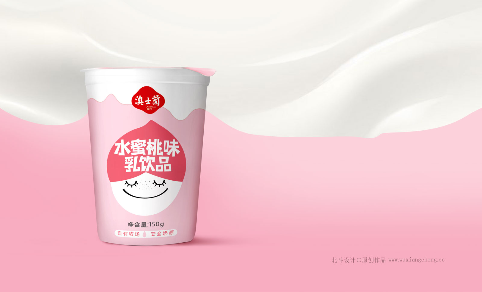
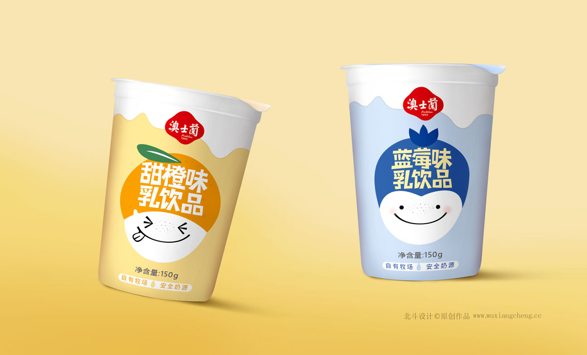
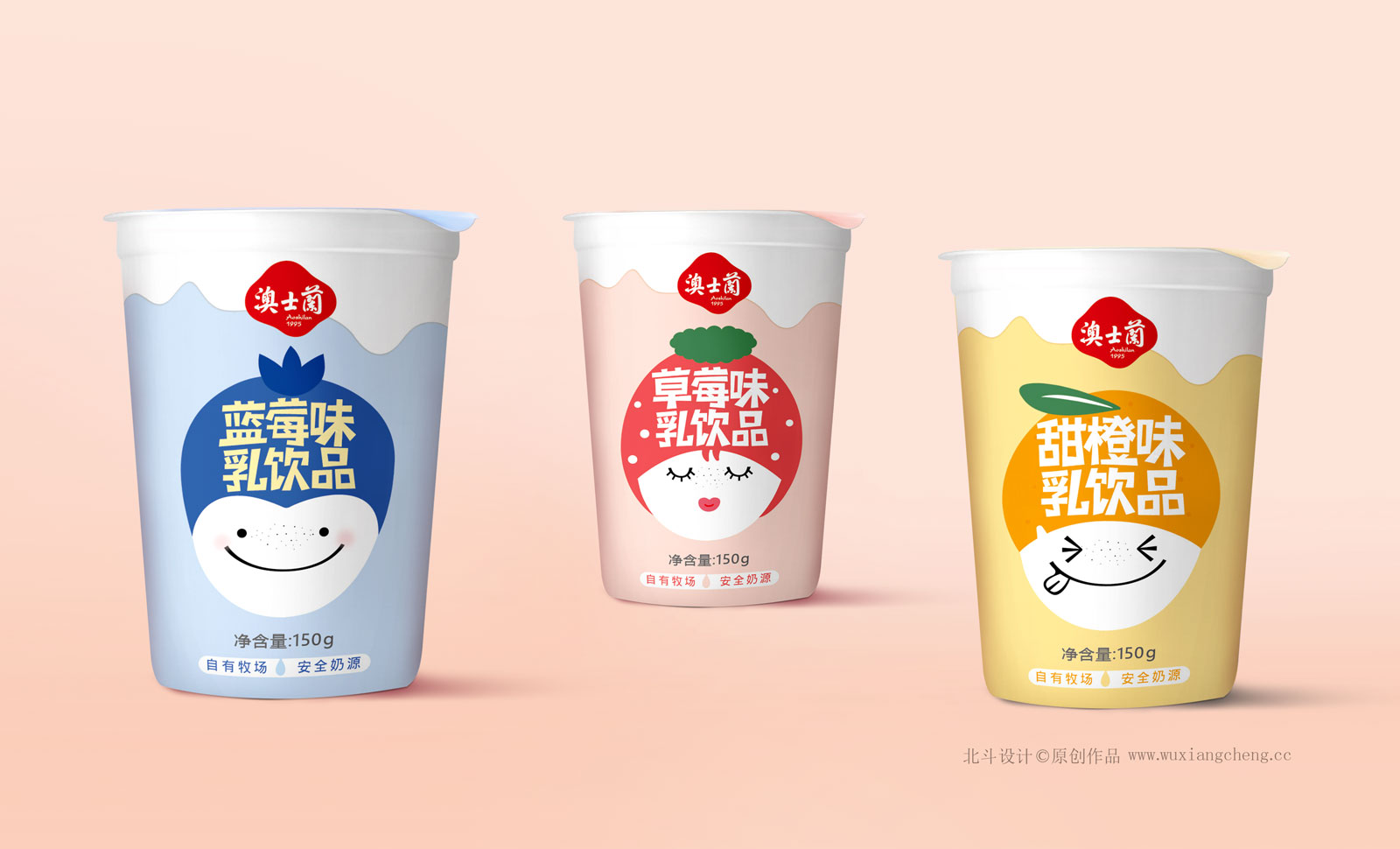
澳士兰牛奶包装设计规划之《学生杯牛奶包装设计系列》
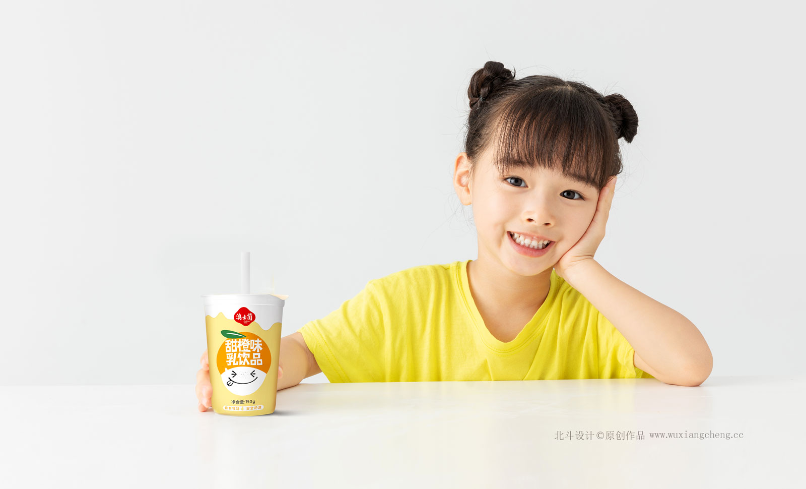
这是澳士兰针对中小学生一族推出的系列产品,面对学生一族,他们的思想是天真,活泼,对于任何新鲜事物都拥有极高的兴趣及爱好。我们的设计要如何呈现出天真活泼的视觉感受,我认为是这个系列设计的核心点。透过对于色彩与心理学来分析,学生时代对于色彩的感知非常丰富,越是明快的色彩,他们的接受对就越高,所以我们对于澳士兰学生杯这个系列产品的色彩定义,首先是明亮爽快的心理认知。而设计的记忆符号,我们的设计师通过卡通的形象来进行创作,用不同的水果来塑造出不同的表情画面,最后结合直观的牛奶波纹形式来体现产品认知。
整个系列设计输出的概念是:年轻,色彩新鲜。
Beidou design focus on the food industry, to provide "aesthetics" and "cognitive" multidimensional case packaging design services.
Macao silan milk packaging design planning of the students a cup of milk packaging design series
This is Australia silan for primary and middle school students group launched a series of products, in the face of student group, their thought is naive, lively, for any new things all have high interest and hobby. Our design how to present a naive and lively feeling, I think that is the emphasis of this series design. Through for color and psychology to analyze students' age for the perception of color is very rich, the more lively colour, they accept for the higher, so we for Macao students silan cup this series product color definition, the first is bright snappy psychological cognition. Designed memory symbols, our designers through cartoon image creation, use different fruit to create a different face images, the milk of intuitive corrugated form to reflect a cognitive products.
The concept of the whole series design output is: young, fresh color.
